
Learn how to choose accent colors for home decor with ease. Discover expert tips, color pairing ideas, and simple tricks for a cohesive, stylish space.
Why Accent Colours Matter More Than You Think
Accent colours are like the jewelry of a room—they add personality, warmth, and rhythm. A well-chosen accent hue can:
- Make your main colour palette pop
- Create mood and emotional tone
- Tie together otherwise unrelated design elements
- Highlight your home’s best features
When chosen thoughtfully, accent colors can turn an average room into a space that feels curated, not chaotic.
Step 1: Understand the Basics of Colour Psychology
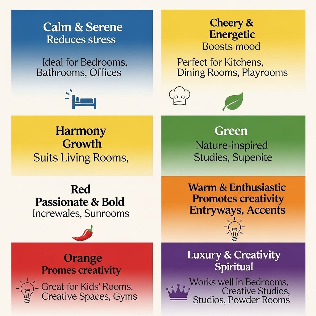
Before you dive into paint swatches, it helps to understand how colours make you feel.
| Colour | Mood/Effect | Best For |
|---|---|---|
| Blue | Calming, peaceful | Bedrooms, bathrooms |
| Green | Refreshing, balanced | Living rooms, kitchens |
| Yellow | Energizing, cheerful | Kitchens, hallways |
| Red | Bold, passionate | Dining rooms, statement walls |
| Beige/Neutral | Warm, timeless | Any space |
| Pink | Soft, nurturing | Bedrooms, nurseries |
A neutral base (like beige, cream, or grey) paired with one or two accent colours gives you the freedom to evolve your space without a full redesign.
Pro tip: If you’re nervous about bold hues, start small—think cushions, throws, or art frames instead of wall paint.
Step 2: Find Inspiration That Reflects You
When learning how to choose accent colors for home decor, start by exploring what feels right.
Browse Pinterest, Instagram, or design platforms like Houzz and notice patterns in what you’re drawn to:
- Do you gravitate toward warm earthy tones or cool coastal palettes?
- Are you inspired by natural textures or modern minimalism?
- Do you want your space to feel cozy, airy, or bold?
Create a digital mood board—it’ll help you visualize color combinations before committing.
Step 3: Work with What You Already Have
Before picking new colours, take stock of your existing furniture and finishes. Your sofa, flooring, or even rug may already dictate your palette.
Ask yourself:
- What colours dominate the space right now?
- Are there undertones (warm or cool) I should respect?
- Which items are staying, and which can change?
For instance, if your sofa is charcoal grey, adding mustard or teal cushions creates a vibrant contrast without overwhelming the space.
Step 4: Learn the 60-30-10 Rule
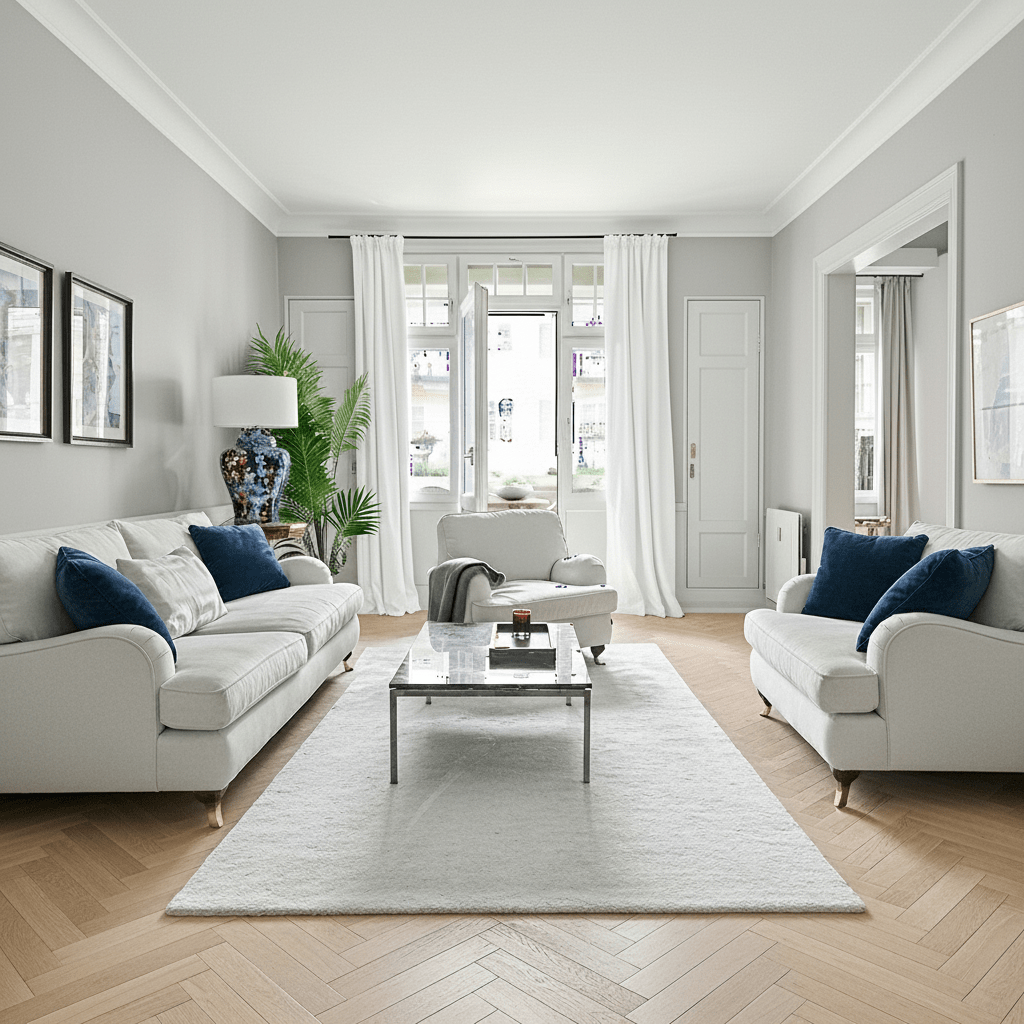
Designers swear by this classic rule for balanced interiors:
- 60% – Dominant colour (walls, large furniture)
- 30% – Secondary colour (upholstery, curtains)
- 10% – Accent colour (pillows, art, décor pieces)
It’s a simple ratio that ensures visual harmony and prevents your accent colours from overpowering the room.
Here’s an example setup:
| Element | Colour | Percentage |
|---|---|---|
| Walls & Large Furniture | Soft grey | 60% |
| Curtains & Rugs | White or Beige | 30% |
| Cushions, Art, Vases | Navy Blue | 10% |
Step 5: Use the Colour Wheel (Without Overthinking It)
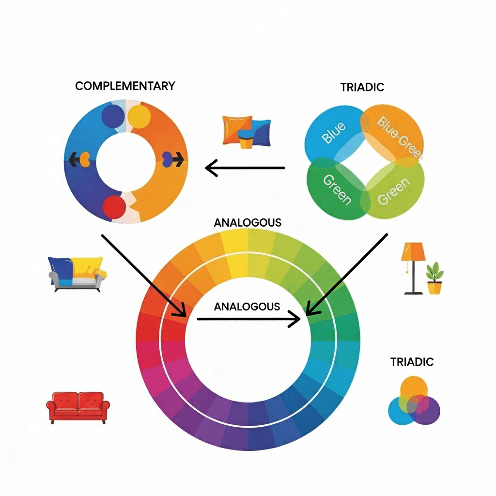
If the idea of a colour wheel intimidates you—don’t worry. You just need to know a few quick relationships:
- Complementary: Opposite colours (e.g., blue + orange) for bold contrast
- Analogous: Side-by-side hues (e.g., green + blue-green) for a soothing feel
- Triadic: Three evenly spaced colours (e.g., red + yellow + blue) for lively balance
You can play around with online tools like Coolors to test combinations that feel balanced before buying a single paint can.
Step 6: Balance Neutrals and Bold Hues
Too much color can overwhelm; too little can bore. The trick is balance.
Here’s how to pull it off:
- Pair warm neutrals (like taupe or beige) with cool accents (like navy or teal).
- Offset bold tones (like emerald green) with soft whites or greys.
- Keep a consistent undertone—either warm or cool—throughout the space.
You don’t want your living room looking like a rainbow exploded—choose a theme and stay loyal to it.
Step 7: Test Before You Commit
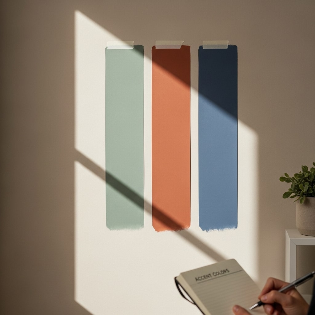
Lighting can drastically change how colours appear. Natural light, warm bulbs, and LED tones all affect the outcome.
Here’s a mindful approach:
- Paint sample swatches on multiple walls.
- Observe them at different times of day.
- Step back and feel—does the colour energize or calm you?
Don’t rush this process; good design takes patience.
Step 8: Tie the Space Together with Repetition
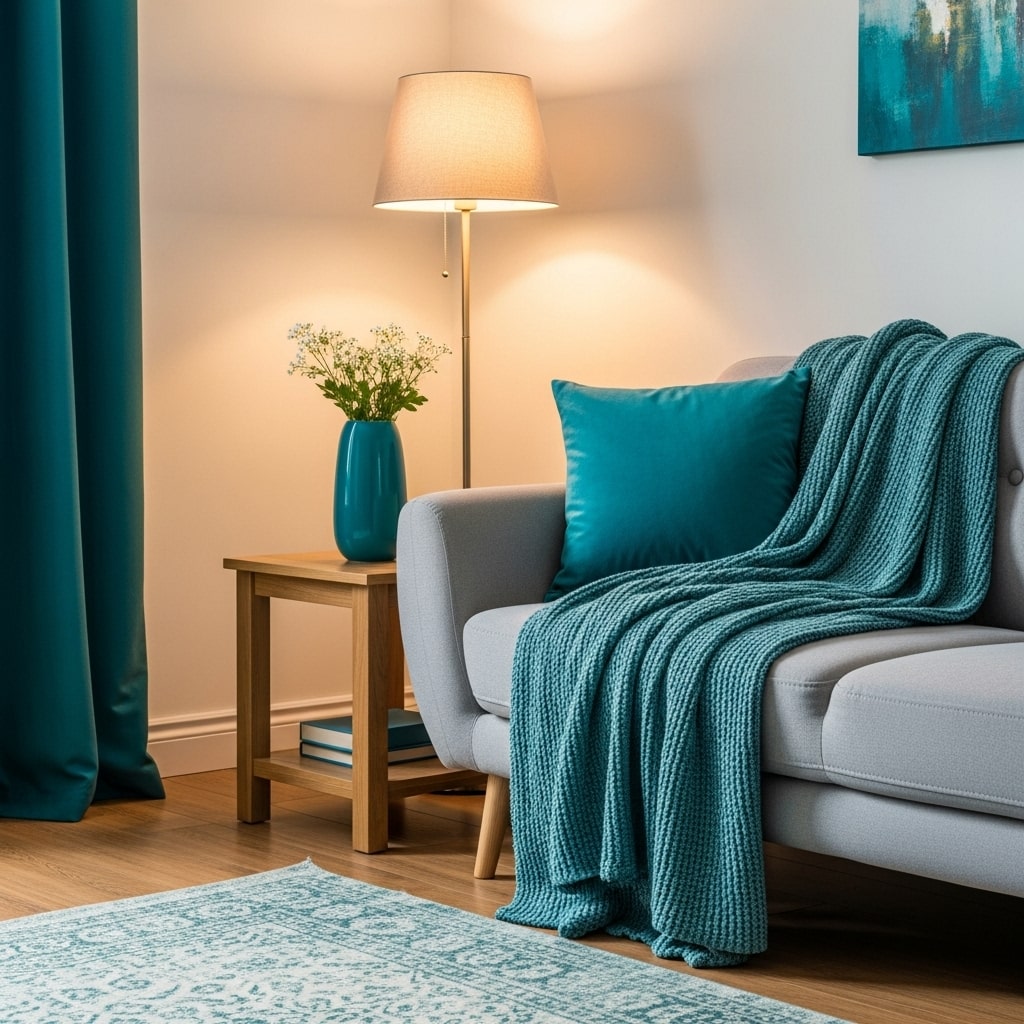
To make your design intentional, repeat your accent colour at least three times throughout the room—in different forms.
For example:
- A teal cushion
- A teal vase on a shelf
- A teal throw draped on a chair
This repetition creates visual rhythm, guiding the eye naturally across the space.
Step 9: Look Beyond Paint – Think Textures & Finishes
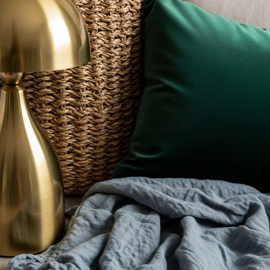
Accent colours don’t just come in paint cans. You can add visual interest through:
- Metallic finishes (gold, brass, chrome)
- Natural textures (rattan, wood, jute)
- Soft furnishings (velvet cushions, linen curtains)
- Art and decorative objects
Sometimes, a brass lamp or woven basket does more for your palette than a painted wall.
Step 10: Stay Flexible—Design Should Evolve With You
Your home isn’t a museum—it’s a living reflection of you. As your tastes evolve, so should your colours.
Try this:
- Use removable wallpaper or peel-and-stick art for easy updates.
- Rotate seasonal decor (like warm tones in winter, cool tones in summer).
- Don’t aim for perfection—aim for comfort.
While how to choose accent colors for home decor, Design should feel natural, not forced.
Common Mistakes to Avoid
Even seasoned decorators slip up sometimes. Here’s what to watch for:
- Too many competing colours: Stick to 2–3 accent shades.
- Ignoring lighting: Always test under real light conditions.
- Mismatched undertones: Warm and cool tones can clash subtly.
- Forgetting texture: Colour without texture can feel flat.
Real-Life Example: My Living Room Transformation
When I first decorated my living room, I fell into the trap of loving everything. Mint cushions, coral art, mustard throws—each pretty alone, but chaotic together.
After learning how to choose accent colors for home decor the right way, I simplified my palette to sage green, warm beige, and touches of gold. The space instantly felt calm, cohesive, and me.
Sometimes, less really is more.
Let Your Home Tell Your Color Story
Learning how to choose accent colors for home decor isn’t about rules—it’s about rhythm, balance, and self-expression.
When you understand how color influences mood, ties spaces together, and reflects personality, you’ll find yourself decorating with intuition, not hesitation.
So go ahead—experiment, trust your instincts, and let your home become a canvas for your creativity.
Feeling inspired to refresh your space?
Explore our latest post on 12 Stunning Living Room Paint Ideas to bring your color palette to life.
And don’t forget—share your favorite accent color combos in the comments below!


Pingback: Trendy Wall Painting Ideas for Teen girl's Bedroom | Savy Home - Savy Home